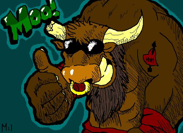
Well it needs shading. And Wormskull, that's stupid. Since when did you learn the difference between huge teeth and bananas? You basically insult the art by saying it needs more of your style. One message for you Wormskull: appreciate it or you'll never live long on this site.
why does it have two bananas inside it's mouth? there is barely a lot of colors, to use shading, you used black stripes, but there's no highlight, apart from these exagerated white spots. his pose looks painful, his neck would be where his heart is, or at the similar altitude. it's really dangerous when your neck is attached to your rib cage.
the shading method is of bad taste, and seems quickly done, after all it's the way the method should be used.
i suggest using a painter's most accurate method, and the relativly best method. for shading on the horns, you can use brown, and on the fur, a brown. you created the illusion of brown on the fur, but not on the horn, it created the illusion of nothing, beceause there is barely a lot of lines. the lightning seems to come from a point, that's a good oriented shading, but there is still shading flaws, where the shadow is projected incorrectly.
like i humouristicly said above, in his mouth he have two bananas. it may add something subliminal in the picture, i often seen the two-banana mouth in my youth age in those senseless cartoons.
the proportion, except the cataclismic placement of the head seems fine, maybe you went for cartoony style, but i commented it as traditionnal art.
i don't find it funny in any ways, were you on drugs? anyway, i suggest you to use something else than MSPAINT. try OpenCanvas, for painting.