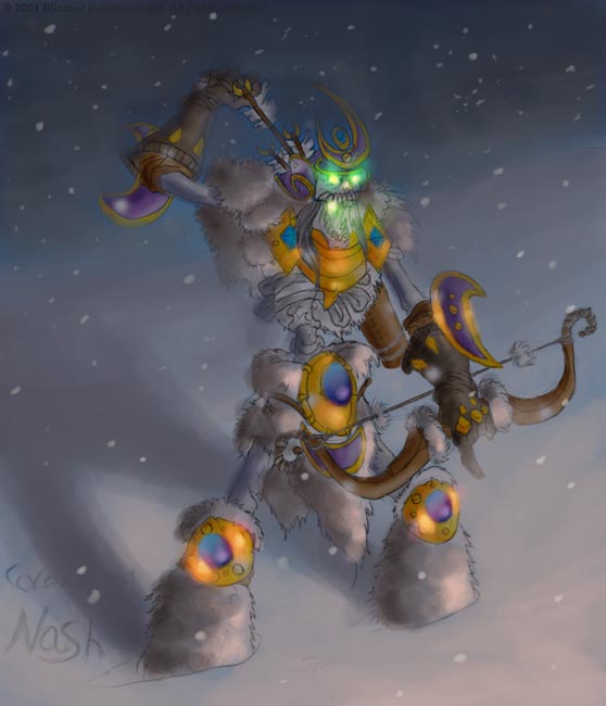
Much better, but the gold and sorts still stick out to much... It's like there's more light on those areas, everything else is dark, shaded, and unnoticeable. The actual work is very good, just the ideas and the lighting on the armor pieces doesn't seem to fit.
Quality 4.5/5
Effort 5/5 (I hate it when people rate effort, because it's impossible to know the skills and how long a person worked on something just by looking at the end product; however, you redid it, and that alone deserves a 5/5.
Ideas 3/5 That might be a little low, because the actual concept is good, but I still don't like the colours, but to each his/her own.
End Product 3.5/5 Great job, decent overall (I especially like the green glow) but again I don't like those colours!

Good job, I appreciate people putting stuff in here, because I like art so much, just have few skills cept with a comp program...