Warcraft III resources & community, 2003–2006 · archived

Phew.jpg

1.13 / 5 (15)
Submitted by WormskullFan Art166 downloads
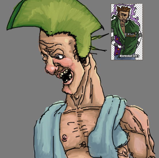
Human Troll Berserker, i guess.


that's to show how much its important to start with a structure, here i began to do the nose, then the face, that was the thing i shouldn't've done. if i started out with a structure his face would be as stable as my av ( or the guy in the logo ), making black lines took me 30 mins, coloring took me hours.
Comments

41
my god that picture is so funny... i love it
looks really bad please take art seriousle...
Maybe because he makes the skins look more evil with them art skills they would look terifying if you can do better then do better.

Wow 1 skin don't go overboard. Hes that good eh? surely I will not be able to get away with this post without wormshit saying atleast 5 things why I am crap.
well wormskulls skinning skills are far greater than his general art skills.
"You have the nerve to say others are shit and act like you can do better? "
i can do better. no arguing about this.
Awful, bloody awful.
i dont meean to make the situation even worse, i just had to find a funny use for this picture, its not that its a horrible art job, its that his face looks like a retard. ill shut up after this...
http://img.photobucket.com/albums/v438/Afroknight/funnytroll.bmp
Here,here Study anatomy first yeah?

When you bend yopur head down as he is doing the chin is level if not below the shold area. The arms are thin. The mouth...I don't think it is possible for a troll or human to do that. The nose looks like it has been hit repeatedly and then had a bomb hit it. And after all the normal sized features on the face grow bigger the eyes seem to grow smaller. The use of rincles and folds are crap the colour is...

You have the nerve to say others are shit and act like you can do better? Art may look strange sometimes but that just plain sucks. Someone remove this it is just wrong. Next time you critesis someone else for there anatomy think about the crap you pulled out of your arse.
WormSkull. Why the ƒuCl< do you like to piss us all off. I couldn't believe the could be art this bad. You aer the most ignorant dumbass i've ever seen.

and it's simply unimaginably better than what you can do.

If it is, than he would have to take his own shit to draw anything worse than that. You say that you accept critics but all we are saying is "niah niah i am better than u". Firstly those words aren't posted anywhere on this board. Second, saying that you suck IS a kind a critic. You just don't know how to take it. I can't see why somebody hasn't banend you yet for constantly saying how sucky everybody else's artwork is when this is the perfect example of how much yours really sucks :evil: .
Well on the bright side it scores top marks for the pile of crap awards. And don't go on about being better than what others can do. Everyone knows they can do better than that but hey I am sure halfbrteads go arround with bushes on there heads. He looks nothing like a troll nor a human.

Keep it up thpough I am sure it will get better. Stop bitching other artists and maybe you will get better replies for your work eh?
The hair looks like plastic. Stromrage, I like you art better, but maybe you and wormskull should pm each other hate remarks instead of filing this "art" with critizicum. I don't think anyone is jealous, you just hate each other because of some pic of a plastic drug-abused human.
"really ugly. look like a mud statue made by a litle child, with grass on the head.
maybe u are an artist, wormskull, but this isnt art. its a trash."

stormrage, look at the origins, not the actions made against your event

inquistor, i did the egg thing 2 years ago, the human head looks nothing like a egg, profesionnal dont do eggs, wtf.

afro, i didnt felt like redoeing it, beceause i can only do ctrl-z 15 times on my photoshop, and i liked the way the distortion came out, otherwisely i would've erased it.

we learn from mistakes i guess, when you do an error on your math trial, dont erase the bad awnsers and replace it by the good awnser, keep it here, and learn from it.

it's simply those invaders that made completly useless posts here.

and remember, this was made for fun, not for a contest, if it would've a contest the head wouldnt be like that,neither the arms. im not a fool, i know how to draw, but sometimes fury strikes :lol:

go ahead and rate my pic "1", i dont care about it, i just noticed the rating today, and i dont care about it personally, i find it great, since it's my art, and thats all what matters really.
I'M GETTING ANNOYED OF ALL OF YOU INCLUDING WORMSKULL AND ALL YOU CRITICS. THIS ART PIC SHOULD BE DELETED OR EVERYONE SHOULD BE WARNED.
Im totally agree with StomrageJunior :wink:
i doubt you made the pic you submitted with a mouse
(worm skull)
I never said that, i have say it just a recolor of a drawing of mine :wink:

your woman doesnt look like a woman
(wormskull)
isnt a woman, its a night elf. and night elfs are very differents of womans. :roll:

I have say 'me, jealous of that? have u see my art?' only cuz wormskull said me 'jealous boy', after post an abnormal horror, beyond all abominations. :shock:

it's simply unimaginably better than what you can do
(worm skull)
and u say its me who 'got a bigger self esteem' ...
your are so ridiculous, worm skull, that you are pitiful... :cry:
anyway, afronight, u had a good idea: worm, redo this pic. or delete it. it can traumatize the children... :wink:
look wormskull, distortion is one thing, looking retarded is another. that last avartar that you had was a pretty good example of a distortion, and the shading on the hair was pretty nice. but what i see from this is a badly drawn face, and even if you had started from the nose, then redo it! hold ctrl+z and just redo the face before you had done to much to go back and undo it. its not really woth posting something if you know that its a mess up. i can also see that the shading transition goes badly, it needs to blend more smoothly. of course everyone knows how bad the face is, and you colored outside the outline, (unless you were trting to do that..)
It looks like he was just smacked by a baseball bat.... I mean the look on his face says it all....

You say you start with peices.... you'll get a better overall look if you "structure" it differently as you stated. Start with a basic shape like an upside down egg, draw some guidelines... then do it... you know like the professionals...

Also his chest looks like it's made of cardboard with a nipple just standing tall. And for god's sake what the HELL is that in your "signature" of the pic.... it's like Don Knox meets Link....
youre so full of yourself wormskull. :?
its a human troll halfbreed. and it's simply unimaginably better than what you can do.
Worm it sucks and like you said for one of my pics. that it has nothing to do with wc3 well.. whats this got to do with it????? ... asshole :twisted:
huuhlalalalaaalalalalalaaaa ca mmmmmhhparait louche.....
me, jealous of that?! have u see my art?
You A twists Wormskull Initially Stromrage don't have said what you sais he have said and it is as a much better draughtsman as you. A question for which takes you for says that ??
have i say 'niahahaha im better than you'??????
no its you who have said 'i honestly do better with a pencil.'... and before that have i said something like this?
i do accept critics, you just give none, you just say" niah niah i am better than u "
i doubt you made the pic you submitted with a mouse, that would be impossible, you made it with a pen, that's another world. i said make a brand new drawing, not scan a drawing and recolor it, i would easily do better. your woman doesnt look like a woman, sorry.
wow stormrage thats really good for a digital art photo, a lot better than wormskull's
HAHAHAH!!! Is this the best you can do!??! pefadic just wait and I will show you true art!!!! :twisted:
huuuuu? digital art? if its art, every people who have a little pratice with photoshop is an artist. And i've already try 'digital art', see that. http://www.wc3campaigns.com/gallery/showphoto.php?photo=451&sort=1&cat=all&page=1
in this case, its just a recolor of a drawing of mine. but its the drawing who made the beauty of the pic, not the photoshop's work. you are naive, worm skull, and u are too much conceited. a real artist accepts critics, and does with it.
He said it relates to a human troll berserker, but I think he meant a human berserker or half-troll berserker or something like that. Oh well, but it certainly didn't fit a description of what a half-troll berserker would look like.
ahh the excuses, now i really think the table has turned. just like how you said, anyone can do great artwork if theyre just devoted to it. wormskull just admit this is bad and get on with your life. if you have a problem with this, THEN DEAL WITH IT IN THERAPY! besides, this has nothing to do with wc3 or other blizzard products, unless youre soo cocky that you thik your artwork is better than blizzards.
digital art is great for gradiants and stuff. people are really more skilled with the pencil, atleast 99,999% of the persons are, unless this percon never used a pencil :roll:

i have a mouse, not a tablet, and i am used to see my pencil leave a path behind it with a certain pressure. with a wacom, i would have to watch the screen.
this art was made on a comp, with a mouse, nuff said.

starting from the nose DO screw up the face, even if its the world's best artist. it may not be in cataclismic proportions, but there will always be errors if you use a such method. i use my method sometimes on my comp, i used it to make my face, but its way more useful on a paper.

and you're wrong, its faster to do something with a pencil on a paper. it's like saying you go faster in florida/canada with a bike rather than with an airplane.

digital art is more complicated than the traditionnal art, that's exactly why there is wacoms on the market.

like samwise, on a certain artwork, he didnt wanted to draw the feets, so he placed a huge axe and multiple and huge orc heads. i didnt wanted to draw his hairs, but i had no choice. his face is intentionnaly retarded. the outlines are something to be avoided, but it was too late when i realized it. when im skinning, i dont use outlines for the face, but i was in an emotionnal urge to make this art, so i didnt bothered to remove the outlines.

the background is grey, and it's all what is needed here, i want people to see him, not the horizon or the sea :D
wow wormskull, id expect better from you. this is just terrible i can only say that. i mean even for digital art, i know it couldve been better. i mean there are no textures in his hair, likes lines in his hair to show the hairs close to each being individual, and the face looks horribly retarded. plus the outlines are to bold, you need to blen it more into the shading. he barely has an ear and the background is a boring grey.
Wormskull, digital art is much easier than pencil art if you have had the same amount of practice or the same skill in both. If you have a nice art program that is. There's just so much youc an do on a comp that you can't with a pencil, and faster. And just because you start something at the nose doesn't mean that the rest of the picture has to look like it got ran over... Your quite full of yourself, and then you deny it and act stupid to get out of it. The picture itself was okay, but now.... Well my feelings have changed to it. OK that is, really I think both pictures in taht and your sig sucks, but thats just me... Hrm, I'm negating myself again... Negating isn't the right word but I can't think of it... Now I'm typing to myself... Okay I'm done.
Stormrage, doing art with a mouse on a computer compared to drawing on a sheet with a PENCIL is a big, big difference.

damnation'sfeet, i totally appreciate your comment! the face is so horribly made beceause i started from the nose, then the mouth, then i did the rest of the face- that technique most likely turns your face in something horrible and it always turns wrong, even if its about small proportions. with a more concentrated method, where i actually spend 15 minutes determinating the facial structure, everything is well placed, it was just to see how much it'd be good without having structures :oops: .

(Personally i like the left eye too, it looks like twizted and posseded, it wasn't intentionnal to make it this way, i just tried to make a humourus self portrait..)

I can't increase the contrast, i did my best at coloring, and my knowledges are boundt to that.
No offense man, but that guy looks like he just got outta a street fight, and his tormentors were useing brass knickles, bent him a new face.
the shadeing isnt too bad.
ya just need a little more contrast in there.
his left eye is creeping me out,and so is his nipple, lol, but ths shadeing, agen around his nose and mought is pretty good.
what do u mean by 'digital art'?
i dont think u do better than me with a pencil..
exactly i did, that's why i said that. you have issues with noses and facial features. They're all hand-drawn and dont really features shading, i honestly do better with a pencil. But you obviously got a bigger self esteem, anyway, i especially hate when i am compared to other persons, and when i compare myself to other persons. please dont do it again. and try doing digital art.
huuhlalalalaaalalalalalaaaa ca mmmmmhhparait louche..... :lol:
me, jealous of that?! have u see my art?
If you say so, any critics or comments, jealous boy?
really ugly. look like a mud statue made by a litle child, with grass on the head.
maybe u are an artist, wormskull, but this isnt art. its a trash.
i did my best at global shading i swear, you mean i add more dark brown?
anyway yes shading is always needed here, but i did the best of my knowledges
Shading might help this little guy out.