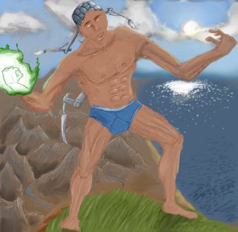
experiment with dodge&burn, and also homework for my art class. teacher got impressed :P
Note: This was inspired by the mountains of zeroth, by the blood mage, by the tinker, and by a strong villager wearing a blue underwear. This isn't porn or sex, it's soft erotica, or something close to it.
Humm...hand are not at the right side and muscle are not very realist but it's nice...Worm are u "quebecois" cause they're the only poeple who use "tabarnaque"
But that guy wears blue underwear... very soft erotica And the left arm seems to be a right arm which has been transplanted to the left. How unfortunate. EDIT This teacher must be masochistic if he's impressed of guys wearing blue underwear and got their arms transplanted... But don't be annoyed, it's just what I think about that.
im sorry, you're just pathethic and a pure idiot. a overused example: michel ange made a statue of a naked man, and also a painting of a naked man on a vatican's curch. on both arts we see his penis, does it mean michel ange is gay, and he sucks penises? No, noob.
experiment with dodge&burn, and also homework for my art class. teacher got impressed
your teacher should call a counciler or your in the closit with him come out dude dont denie you homosexuality and i doubt people will like you so pull the trigger pull the trigger
hmmm.. i thought worm with all those comments you made soundin all bad at least 12th or pre-college for you, but hey i know i drawed this semi-crappy in 9th grade, but it is pretty good, and black label stfu, no one cares, read the below post, he is in 9th grade so that is 14-15, and it is pretty good for Art I, and the teacher has to say good thing, it is their job to keep you going on, but this is ok, if i will ever get a scanner in this place then i might submit some of my latest projects,
Final Result:
4/5
Second Thought:
4.35/5
it is really good in most places, but in others it is just horrible, and either your dude has nothing down thier, or you just don't do definitive, but wormie, you will LOVE/HATE college art, they will bring in naked people of all sorts, and say "Draw this" our last models was a really hot chick, but the one before was a really fat dude, they say it helps the art culture, and really see nothing wrong with nudity, like wormie says
its nice, but i dont like the shape of the human body, such as the arm and leg width, also try to give a better cuviture to the abs and pex, and the left arm(his left) is horribly mishapened, also you need to make a better flame and glowing effect on his arm. gj wormskull, for not submitting crap in the art section this time aslo black label, stfu, i see you flaming all the time, yet you have ceased to have proven yourself worthy.
I do not see the erotic aspect of this... I do not WANT to know of the erotic aspects of this....
I love the unsafe and nude vs. metallic and power theme, the picture is very pleasant to look at, actually. Yet, I can't even figure out if this is supposed to be like this, cause it don't bother the picture, but the hands are reverse.
I think its the drawing style and color scheme, but this drawing somehow relaxes me, 'spite the dynamics
you need a can of brain, and nice triple post. if you say it sucks horribly/miserably, fine, it's your opinion, but tell an argument, or a way to improve, otherwisely it's obvious your comments are worse than mine
Ok, the reflections on water a good but isnt any about blizzard/warcraft....like your another pictures.How many time before this pictureo will be delete
if you did this on paint then very good if you did it freehand then....
meh
try using more color on the skin and make the left arm like the right, the left is a bit smaller, and the abbs go to the side while the pelvis stays in front, fix it, the abbs should be directly above the "male reproductive organ", and fix the left hand like kerrigan said, lower body is cool, upper is kinda messed a bit, abbs are out of place, and the water in the background is messed, dont use such a dark color, use a light color and mix it with darker, dont just use one color on the sea, i prefer on my drawings to use a normal blue mixed with a cerulian and a bit of indigo and a smige of forest green, not alot of it or it will make it look bad jus lightly, and make more a reflection, remember the sea isnt a solid it is a liquid were everything is reflected, looks pretty cool tho, cept for the bad color, it is a nice freehand, and what grade are you in?? so i will know what level of art you are in, i have mid-college art, but i dont draw guy's that good, mine is based on anime girls, dont know why, anime just looks really cool to me, real life drawings like this, i dont like very much b/c anime is easier to draw and looks alot better
much better than the other ones!! its not very smooth, looks boxy, so you might want to fix that. also, his left hand is bent backwards. change the perspective to forwards unless its supposed to be like that. EDIT the body is also too wide. since of course most people base drawings on what shape their body is, you might look like that, but i think its a little strange having the body so wide.
doesnt look too bad, only prob seem to be the hands, they are really wrong, bad structure, the thumb is like on the opposite side, the arms are kinda skinny in comparaison with his torso, moutains are really nicely done its an eye candy
...First post or not, your post was horrible.. ou completly bypassed by my drawing. he have no pants, he have underwears, its how i always draw, im not homosexual, i just find it good for developing the ability to draw legs. i used a picture of the leg&tibia muscles to guide myself tho