Tari: yes i used a thick pen, cuz i don't have some good pens anymore, lost them. i used an H.
Wormskull: yes ofcourse i looked at that pic there isn't anything else to look at from this creature. it's a shame though, cuz faerie dragons look really cool. (cute)
thx wormskull, but though this was a very short making and it was like 3-4 years since i last painted something. and i used a real thick pen, and the whole picture could fit into 1 5A paper. hard to put in detail
the rock ans grass are not to judge, cuz i couldn't just let him float in the air in that bodyposition so i made a quicky
Warshy, I think you should start with just getting really good at drawing and painting all for hand, photoshop is the new thing going on, but it is a shortcut. and still, never do hard contours. I know its hard, I still do them myself, but as a teacher to me once said "real life has no lines around everything". =) just a question, you've just used one pen with this, right? a HB?
i assume you used this picture, since it looks alike; http://www.blizzard.com/war3x/images/screens/concept/ss06.jpg you could've put some definitions for his muscles, now he look like a rubber toy. the only part i'd find good would be the wings, there is some nice shading here and the patterns are interesting. im not fond of the method you used to do the rock and the grass
the hard contours are just a result of me not knowing if i should have colour it in photoshop. it was what i intended to do at first, but i have never scanned in -> colour a picture before. i would just ruin it...
cute, pretty good shading. I think his front legs are a bit small, and I wouldn't make the contours so sharp in contrast with the rest of the piece. just spend som more time with it, and you will see that it will just get better. =)
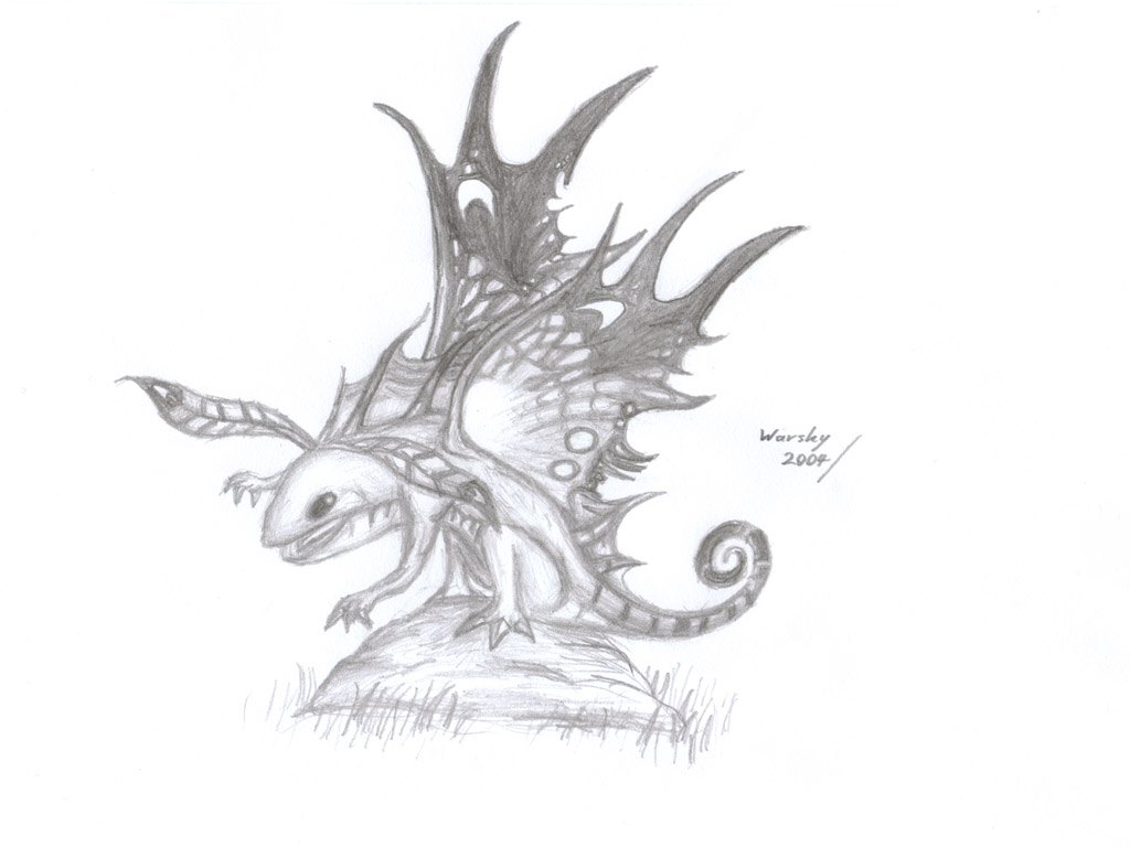

 there isn't anything else to look at from this creature. it's a shame though, cuz faerie dragons look really cool. (cute)
 i would just ruin it...