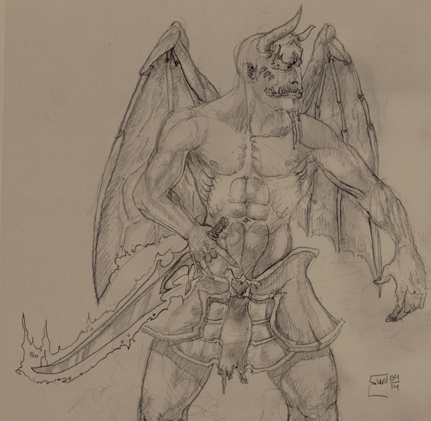

Gorgeous shading!  I say, I think its the pelvic armor that is too big, than the arms and wings that is too small. Muscle definitions are marvouless, not couinting abdomen and chest, tho'. They are allright, but seems misplaced/too far to one side, and twatting over each other. But overall still very well drawn, and definitly worth a 5, had it not been for those kindda obvios to the eye, glitches.
4/5
I say, I think its the pelvic armor that is too big, than the arms and wings that is too small. Muscle definitions are marvouless, not couinting abdomen and chest, tho'. They are allright, but seems misplaced/too far to one side, and twatting over each other. But overall still very well drawn, and definitly worth a 5, had it not been for those kindda obvios to the eye, glitches.4/5