know you are a good drawer but you not so good at human props.. well this is a demon, so whata hell! 
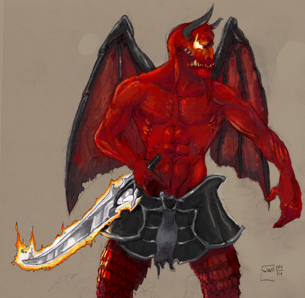

 Its the light fade effect, from his rear to the front. He looks blood red overall, but it appears he has an even more shiny rear - as in, (especially round the shoulders and on the right side (when you look at him)) there are some features that should've been of the same flat-red as the wings, instead of aglowing. The wings seem plastered and dead, cause the Archdemon main, is reversely colorfading in comparison (hopes this makes sense) Oh ya! I give Tari that, the sword does look as taken from a whole 'nother dimension (somewhat cartoonish?
  ) Anywho!!!!!
 The coloring really did a whole lot overall, and totally worked the muscle definetions. Thumbs up! And the eye is just a gorgeous little pricklet, along with Pelvic Armor, which to me is the best part if it all, really makes for a terrific terrifying appearance