the pink might be too bright as well as the light green... you might had endarkened the whole picture. Further from that there aren't really many aspects to point at....maybe that you you had drawn this a little bit fast in my eyes...please tell me if that was not the case here.4/5
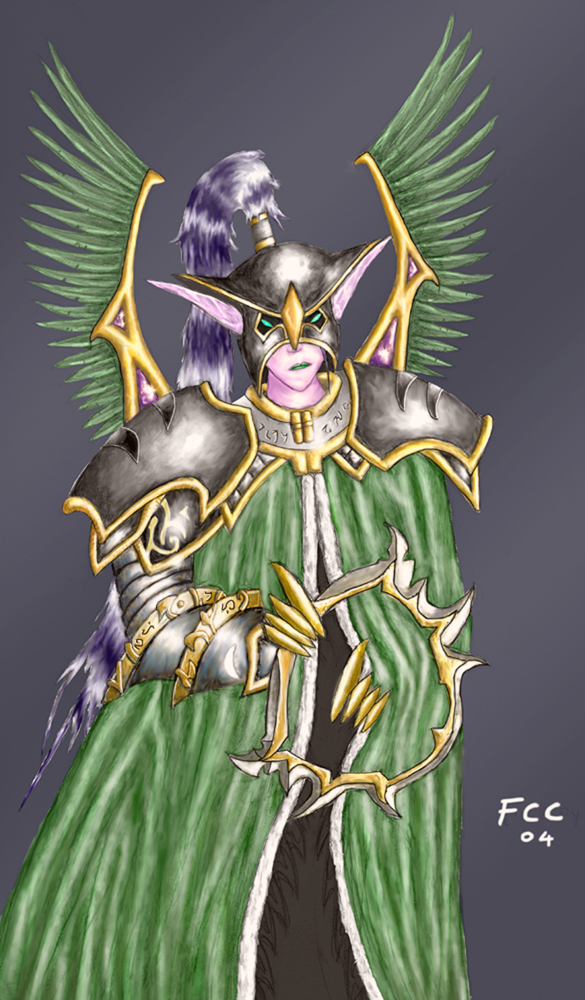
Good work, but I think there's too much white spots (areas of no shading) Her facial expression seems a bit distorted and her skin should be a darker purple.
her ears are from profile view. there are few logical flaws such as the ears, the missing palm of the hand and the diagonal eyes. you got potential if you're really 11 years old, but you could pay more attention to the drawing. you did apparant efforts, but it would be good to view your drawing from different perspective and try to view the errors. myself i drawed a fairy that seemed perfectly fine from my view, but later i noticed that her shoulders were too small, thus i threw the drawing that i spent one hour on at the trash. back to your drawing, the coloring style you have is unique, and it's nice to see some variations of colors on her forearm platings. nothing much else to say, good job, and i wish you good luck against Muoteck.
i'm sure you noticed that the lips and the nose isn't in line, and that the lips are very small. her ears are gorgeous, a little bit short. the hair could be much better done, it looks like those things you dust with right now. the blade looks very thin and as if it's going to break if she uses it. and it's a little bit confusing that one of her arms is hiding inside the robe, yet the other one is outside and doesn't afffect the robe at all. a little more practice and she will look really good.
eusira NEs can have a pink tone so there's no wrong here except that the weapon looks a bit weak, make it bigger. the colouring of the cape isn't that good. looks like affroknight coloured that part... 3.5/5
Well, it's very good. But it really doesn't look like work, but I'm not assuming you ripped it. However, the face and eyes are a bit distorted, and it seems too pink. 4/5


 Else i like it alot, keep up the GJ.
 i have nothing 2 say about it.. just that its good