


Try setting the opacity to more than 50%
Comments
5MAN! I'm no noob!
Thats what ive done!
Try it by your own! You will get the same results!
Thats what ive done!
Try it by your own! You will get the same results!
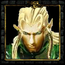
Apparently you don't know how to make a disabled version of an icon. Create a new layer over the icon, and set its opacity to 50%. Then fill it with black and voila, you've got the right "darkness". Brightness' effect can vary a lot!
~Daelin
~Daelin
its brightness 50%.
They're looking so bright because i used much yellow...
They're looking so bright because i used much yellow...

The Disabled icons are far too bright. Anyway, they're cool. They will prove quite useful  .
.
.