Wow, amazing OgeRfaCes! Really cool!
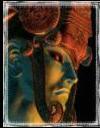
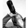
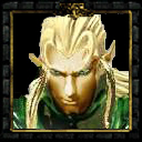
Oh, and yes, omg. The passive icon does look a little wierd It's still very good, though
Yep. It's good, but the passive looks funky and it has two little gap spots. Overall it looks great

Wow, amazing OgeRfaCes! Really cool!
Oh, and yes, omg. The passive icon does look a little wierd It's still very good, though
It's still very good, though Impressive work... However, you still need to work on the upper-left and bottom-right corners, so that they reach the frame. And make the shadow (smoothing from frame to icon) go smoother. In the upper part, I see a dark part, followed immediately by purple. Make it more gradually.