


I would consider that an insult Gorby but since I know you and the icons you make I will skip it...
Comments
10As for your ligness ray, i mind you should make bordures darker... look strange, useless but good 5/5

Darken it just a little bit,not to much,just enough so the people can recognize it more 
The dagger is a little hard to see. I can see it... just not much. Maybe if you tinted the sword a tiny bit of a different color, but hey, it's my opinion.
Well what color shall I use for the dagger? If I make it red it will look like a combination of frost and fire. If I make it green it won't look good either. I'm empty for ideas

The dagger should be outlined with something,not particularly black,but its kinda hard to see.

The metal frame isn't actually right, it should be more thicker, i think. And, add the shade araound the edge, like in Tiki tutorial.
The dagger is a little hard to see. I can see it... just not much. Maybe if you tinted the sword a tiny bit of a different color, but hey, it's my opinion.
Thanks again Daelin ^_^
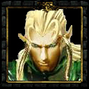
Very nice icon... 5/5
I consider this Icon finished, but I still want it to be improved, so please guys post suggestions here.
Thx
Thx