Warcraft III resources & community, 2003–2006 · archived

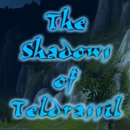
Shadows of Teldrassil- Chapter One

4 / 5 (9)
Submitted by ForgottenLightCinematics1,384 downloads7.5 MB
The Epic story of The Shadows of Teldrassil is told at last. Part One in the Series
File Name
SoT1.w3x
Map Author
ForgottenLight
Suggested Players
One
Difficulty
160
Number of Missions
148
Type
.w3x
Tileset
Ashenvale
Playable Map Size
148 x 148
Map Size
160 x 160
Regions
43
Cameras
50
Sounds
5
Units
261
Doodads
2876
Variables
5
Triggers
10

This map is unprotected.

Download

Comments

24
OMG!!!! i downloaded all the episodes but i cant get episode 1 to work!!!! :( :'(
Very nice!
But the text is sometimes much too fast!
Atmosphere is good. :)
Much better than in many other cinematics!
It's pretty nice. Almost all the music is from WoW (clearly...how did you manage that? I can't get it's music anywhere...not from the MPQ that is)
in mine didn´t appeard that "tedrassil" bug, p.s this was a nice cinematic, but the dialogues were way to fast and there was no atmosphere, the terrain was nice, you could have done better, ppl wacht part 2 it is much better :D
This map contains much bugs, I can't believe that you show it ...

I just noticed 2 bugs, in about 1,5 mins that was too much and so i canceled it, cuz it has also no atmosphere.

1.bug: the title is not correctly and is written breaked
2.bug: the portraits of the magician and the warden didn't change

further: the skins are all with no love, all looking ugly. I would change if i were you.


:roll: :roll:

1) The Title is a known bug that shows up on slower computers. However, it desplayed fine during my extensive testing, and that is why it is there in the first place. Up your resolution.

2) Yes, they do. Sorry to make you feel stupid. Watch the cinematic again and more closely if you don't belive me.

Lastly, if your refering to the children's skins, they are suppost to look like that.

:arrow: I am getting tired of people chewing this out because of what they interpret as 'bugs' because they're not paying attention. Or have their settings messed up. So, one pay attention before you complain about something, and two, don't blame me if your own computer screws it up for you.
This map contains much bugs, I can't believe that you show it ...

I just noticed 2 bugs, in about 1,5 mins that was too much and so i canceled it, cuz it has also no atmosphere.

1.bug: the title is not correctly and is written breaked
2.bug: the portraits of the magician and the warden didn't change

further: the skins are all with no love, all looking ugly. I would change if i were you.
The stupid, bugged text says its a 4kb download... and that is set automaticly, I have no ability what-so-ever to influence it. Actual map-file size is 7,743 kb (a bit big, I know, don't worry, I'll work on keeping the file size down for later chapters in this series)
-

BTW, I'm still hungry for some more feedback!
Hi. One thing you might want to correct on the download information. The text says that its a 10 kb download. But the download I've started for this indicates at just under 7.5 mb.
"The Warden didn't have any lines in that sequence..."

Yeah, as I said in the same post -

Ah, I get it. The priest and the... uh... thing in the lamp (I don't know what the heck it is... but I think its a transparent priest)... had the same portraits, and since the names were too confusing to remember, I just mixed up the three.


Anyway, there are more spelling/grammar mistakes than just missing an apostrophe in "its". For example, "breathren". The correct spelling is "brethren". But yeah, you get my point.
Well, I don't know what to tell you. My resolution isn't set that high, so... *shrug*

As for the custom filter suggestion, good idea, exept custom filters are the one thing I havn't been able to get to work. What dimensions does the image need to be and what format, and sub-format-options does it need?
(Send me a PM on wc3campaigns, or post in the thread for this project there)
I also had the problem with the following title:
"The Shadows of Teldrass
il"
You see, it was even worse at my computer. I tested it at 800x600 on my iMac and 1600x1200 on my PC, in both cases this was the result.
I've no idea what the problem is, but it looks really stupid. You could avoid this by using a custom filter, than you could also add some details to make it look more interesting.
The thing isn't a lamp, its the ancient Night Elven equivilant of a Phone. A magical-version of a holigraphic communicator.

The Warden didn't have any lines in that sequence...

I'll look, but I don't think there was suppost to be an apostrophe in that 'its'.

the 'L' in the main title is NOT on the second line. not even close. Maybe you should up your resolution setting because mine is not that high.
After the people go through the walls, and the mother and priest are talking, the portrait of the dialogues didn't switch at times to the warden from the priest.

At least, these errors occurred for me.


Ah, I get it. The priest and the... uh... thing in the lamp (I don't know what the heck it is... but I think its a transparent priest)... had the same portraits, and since the names were too confusing to remember, I just mixed up the three.

When the priest and warden leave the house, both of them stop outside, it's easily noticeable, next time, make them go out of view =).


There still were dialogue errors (missing an apostrophe in "its", etc).


In the beginning of the cinematic, when it shows you the T h e S h a d o w s o f T e l d r a s s i l thing, the L is on a new line.
There may have been a few small misses with movement, but I'd like you to point out even one dialogue mistake.
Also, I watched it for the zillionth time just now, and no camera ever clipped a tree.
Lots of errors, in dialogue, in movement (The demon went through the column!), one camera clipped a tree, the terrain, (why are the outer city columns so thin? I could fit my body through there.) and some other stuff I forget.

You could have added some flowers in the lawn, some grass too... Heh, it was funny to see how big the shrubs around the tree and gates were in comparison to the two kids.
Okay, thanks for all the feed back.

A few response points:
Yes, the wall is enchanted, its a secret entrance built into the house.

There's alot of time that passes between when the DoomGuard is hit with a Starfire spell, and the scene in the forest, a couple of hours at least. Nothing really interesting happens during those hours. Their both running scared, and lose each other because there not thinking to stay together.

Next, about the academy, That was the attack that started the War of the Ancients. The entire city and most of the surrounding landscape was utterly destroyed. All that dialouge was only about the character's future plans. Which, along with everything else in his life was shattered in the destruction of Zin-Azshari.

The Skin colors and proportions and stuff on the skinns were deliberate (exept the plainness on Kriger's eyes, that was not intentional, and his hair was suppost to be blue...). The reasons for Ulyaoth's slight deformities are explained in a later chapter.

The area where they meet is a cultivated Lawn around
the house. why would it be anything other than plain grass?

The last shot before the escape, was intentionally lowered, It was supposted to be focused on just the kids and the demon's feet or something like that...(I probably should have zoomed it in or something...)

Lastly, the Parent's death scene, yeah, wasn't quite as... (can't think of a good word) as I wanted it to be...

Okay, so thanks for all the feedback so far :D and I can't wait for more.
hm i think the thing with the wall is quite confusing thou :)

about the story: ... the main caracter was accept for this academic - thou why isnt he going there after his mother got killed???

btw. u got a quite bad look at the scene when the little talons kills the big daemon - perhaps use a different angle - right from the other side perhaps

still good work - perhaps add some more doodads - especially in the yard where the 2 boys meet - there is nothing but green grass ^^


thou 4/5 from me
Sorry for taking the cinematic's music down; I seem to have had turned the music off... i changed it in the review. :oops:
With the wall I didn't understand when I first read it, also sorry. But it looks very strange anyway and is unnecessary.
Okay and here's what I think.
It's a great cinematic and I liked it.
Maybe not CotD or CotN but still damn good

I'd have to agree with the walking trough the walls and the boys faces but it did'nt take down the cinematic's score.

There was another part I did'nt like.
When his parents were killed it did'nt look too great.
And how does one actually loose your friend while he's running with you.The only way that could've happened was if a demon captured him.Or if he just left his friend while he triped or something.But like I said still was great.

5\5
Dude the mother says "Lets go through the enchanted wall its quicker" THAT MEANS THERE GOIGN THROUGH THE WALL CAUSE ITS ENCHANTED!!!!
OK, it's time for a complete review!
Here is it:

The story seems to be interesting and exciting. The back-shift is a good idea.
The terrain design is nice, but some more details would advance it very much. The skinning is not bad, too, but the color of the little boys' faces needs habituation.
The effects are well positioned, not too many or too big and what they should be: effectful.
The camera motion and usage is OK, a bit more motion won't be bad.
The sound effects are used in a sufficient quantity, some would perhaps better underline the effects.
The music is good, nothing to critisize here.
There aren't many bugs in it, but one looks very stupid: The mother says "come in my boys" and all of them go THROUGH THE WALL into the house. Show at least a door in it, if it isn't avoidable to let them run through the wall. The best would be to cut this "wallbreaking" scenes completely out, I think. They aren't important for the story and just look as if they were ghosts, very strange!

All in all:
story: 5/5 (if continued)
design: 4/5
effects: 5/5
cameras: 4/5
sound+music: 4/5
bugs: 4/5
__________
:arrow: 4.4

This a nice start and the cinematic series should be continued in that way, just cut out scenes that don't look good! :wink:
Waiting for the next part...
Yours truly
Waldbaer

PS: The size... could be optimized very much. The most important would be to set the encoding rate of your MP3s to at last half of what it is now. 128 KB/sec are really enough for cinematic music. The earth ball at the beginning is also very nice, but it makes the file about one and a half MB bigger, what is too much for a 3-second-effect, I think. Change the quality of the BLPs, especially the CloudMaps don't have to be that sharpened.
Following these tips, the map size could set to about the half. Optimization of this kind is strongly recommended for all your future maps!
If you don't have the tools, ask me. Otherways change it!
109 downloads and only 2 rather vague comments. I like some Feedback from any of you :)
SIze DOESnt matter!!!!!!!!!!!! if its a nice map!!!!!!!!!!!!!!!!!!!!!!!!!!!!!!!!!!!!!
why do you rate your own work???
im in test week so i cant check it out yet but when i did ill post comment. first comment:
big size :?