Warcraft III resources & community, 2003–2006 · archived
UberPaladin.mdx
not rated
Submitted by KonbladeUnits - Humans331 downloads529 KB
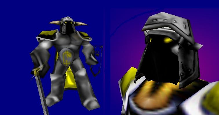
My latest model, simalar to the WarCraft II paladin(no horse). Animations were unchangable, I will keep trying to make new ones, he has a shield and on his cape he has the Lorderon Emblem. All textures are like this Textures\_______.blp
I've been sitting here silently downloading models and reading the imbecilic comments that people make on this site, but this one by Monkey Magic was the final push to make me register and comment on this drivel. Monkey, please don't try to sound intelligent by using words like "idiom" even though you obviously have no idea what the word means. There are enough pseudo-intellectuals out there without half-wit junior high kids trying to sound smart by using, and completely butchering, words they picked up in school that day.
My apologies Konblade. I edit many people's works for my own purposes. I don't usually post them though. I was just curious if anyone was interested. I meant it in no way as a stab at you.
I edited the model. I fixed the shoulder pads a bit, took OFF the sword and shield and tweaked the horns. Also, i gave the body a complete reskin. If anyone wants me to post, just ask.
Here's what would make this look far better: - Close the helmet a bit more. Like the Revenant. - Give him better shaped/colored eyes. - DETAIL THE ARMOR! - Color the shield a bit more - Move the sword closer to the middle of the hand - Lose or reshape the strange belt buckle thing. - Fix the Popeye the Sailor Man arms.
After all this, this model would be fantastic. Other than that, 2/5.
hm hasent download it but it is a very bad screen u have gave us until later i wont vote but now it is only worth 2/5 yet good work il be needing this on my map kepp it up and finish him 4/5 if he looks bether in game than in screen





 4/5 if he looks bether in game than in screen