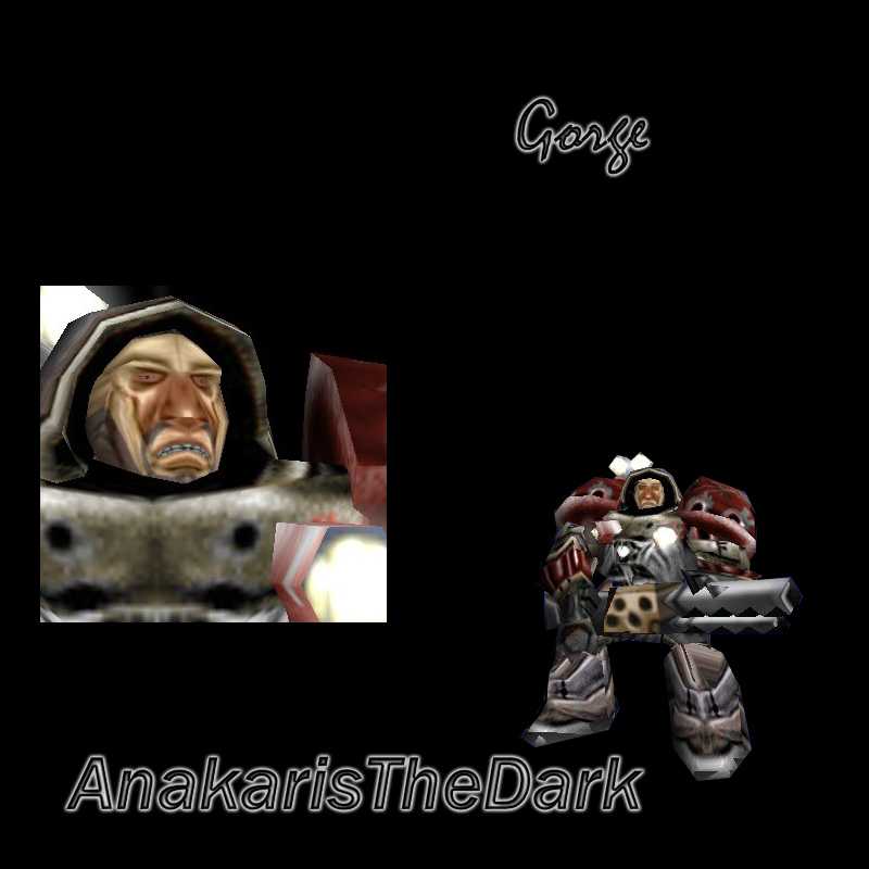
Its Gorge from Unreal Tournament 2004. 100% freehand, this is kinda my first skin in a couple of months so I was a bit rusty. I didn't change the gun b/c I'm going to alpha it when i get something besides adobe elements that way you can attach different models to him. Path is Units\Critters\Marine\SpaceMarine.blp
vegito plz keep your comments to yourself, as you are trying to prevent someone from helping a new skinner that is in need of a little help.
as for the skin, i agree that the nose is too wide, and since i have never played UT i dunno if it looks like gorge (or george or whatever) and maby take off the lights behind his head and edit the left foot (our right i think)
Ok. "The holes" w/ too much dodge worm are actually bullet holes. I cant widen the stubble because I modeled it after a certain character from ut, thats how his stubble is. For the face, the nose is really small as it is on the face, but I guess I could always make it smaller. And I know the screenshot sux And i like ur critisizm but the "its not a good skin" part is probably what looked like the flame even thou i know it wasnt.
The problem is that wormskull is probably ot of place since all effort he wants put into a skin is not what the creator have time with, and probably wants to make more. Aswell, dont you rate a little too low allways?
Ive sent a PM to Darky asking to ban him for his trolling and I havent seen him all day even on the new skins hes gone people be free again wormy is gone. as for the people backing up worm. I dont think you guys understand all of it yet (sorry GotGunz)
Oh hell. I think some people need to get their ideas straight.
WORMSKULL. IS. TELLING. THE. FUGGING. TRUTH.
Get it through your thick skulls. You are the people trolling him! Give him a break. He is the only guy that I have seen give good comments that have constuctive criticism. Unlike almost all of the rest of this site who will stalk you for the rest of your life because you made a comment saying you "didn't like the colours."
As for the skin, I quite like it. Is it freehand? Part freehand? My only suggestions would be to make his eyes larger, and more open, and give him some eyebrows. Also maybe widen the stubble bit, otherwise he looks kinda chinese, unless that was your intention.
Wow u guyz got a lot of hatred towards wormskull...i agree with saikann, itz not like wormskull is flaming hez just giving some constructive critism. Cold_Wolfe13, no one deserves to die, especially not for what wormskull did.
gay wormskull strikes again-my duty: tell the world of his gay acts, he criticizes but has never made a skin before... I HOPE U DIE WORMSKULL-U DONT DESERVE TO LIVE!!!!!!!!!!!! once again-make a skin or shut ur nmouth
the screenshot could be better, you included the portrait of the man, wich is good, but the small man in the corner could be way wider, it doesnt matters if it covers a bit the portrait, it would be original tho.
just make the nose in the UV smaller, and it will be less stretched, instead the skin next to the nose will be, but that's not important. oh he looks like a edited marine, not a blatant recolor, it must have took some effort and time to do this. in this screenshot he doesnt look like very thought, menacing or harsh, you gotta fix the UV some more, its not perfectly placed. let me guess you used burn n dodge in most places? at some places there are "holes" ( where there is too much dodge/burn at one point, or where there be a lack of it, and in its surrounding there is ).. try to use the smudge tool ocasionally, better at 80%, so it looks like more blended and equal.
not a good skin, but have potential, someone people could use it now. it's not horrible, but there is always some flaws, but its way better than 3/8 of the content that is submitted here ( recolors, lack of effort/ editing )

 And i like ur critisizm but the "its not a good skin" part is probably what looked like the flame even thou i know it wasnt.


 hes gone people be free again wormy is gone. as for the people backing up worm. I dont think you guys understand all of it yet (sorry GotGunz)


 4/5
4/5
