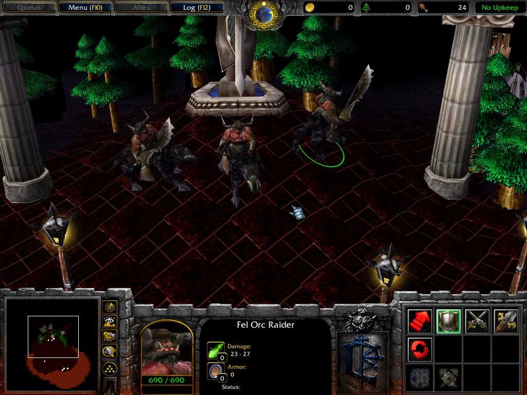
changes are easy to do, but they're harder to make them good. sorry for the misunderstandement about fel orcs and stuff. then his body have too small details that aren't really noticeable in game, the best would be to keep it simple, it looks like you zoomed in 1600% and made it pixel-by-pixel. smoothen it up and put it more into the skin, so it looks like more natural. wargs in the lotr movie where way more shiny and richely colored, they're not balrogs without fire.
The skin is good, and I like the freehand. Wormskull's correct about the screen shot, crop them if you can. There's an image cropper in the tool section.
I see Wormskull has refined his critiques, maybe from observing that no one responds to blantant insults.
Remember, nothing is perfect, everything can be improved, so don't hesitate to if you want/can/have to.
of course i edited the helm, Freehand. It's not a Fel orc, it's a LOTR warg rider. I'll fixe the other stuff in the future. if you see the normal chaos wolf rider becide, you'll see BIG changes.
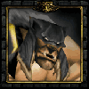
If it's "fel" the skin is way took dark, it should be red-orange with high contrasts. Ingame, in the portrait it looks horrible, please fix the face, don't leave it as it is, blend all the stuff but keep it detailed like on the helm. on the face i see completly useless grey and light grey ligns. face needs fixing, you can do it and you will. i sugges you to use Wc3viewer instead of taking the screenshot in war3 itself, this way, we can see the units 6x closer. in this screenshot only a small part of the screenshot is viewable, the rest is uninteresting background, interface, time, gold, trees, upkeep, yknow, we don't need to see that, don't waste bandwith with such screenies.
I also suggest to lighten up that wolf, he's almost black, nothing interesting here. it can be fel without being as black as a bat. they're demonic, not undead, archimonde has a bright skin color, along with his demons.
on the unwrap, i only like the helmet, i dont know if you edited it or not, but it doesnt matters.
keep working on it, there is a lot of space for positive changes.