Warcraft III resources & community, 2003–2006 · archived
Destroyer Of Life.BLP
not rated
Submitted by RetardedFishUndeads80 downloads221 KB
ScreenshotIn-game
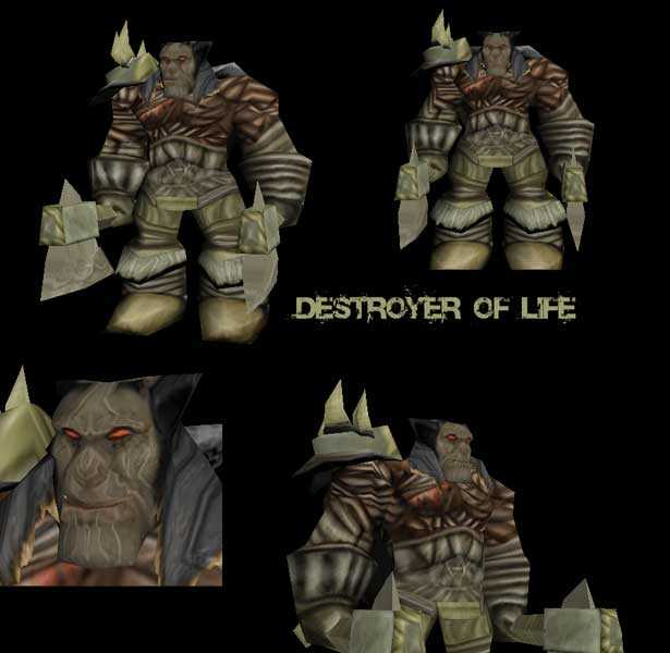
Destroyer of life, some sort of evil monster thing.Mainly free-hand and some re-colours. I left his cloak thing alone, cause I like itMy second skin, credit plz if you use
Its really nice. Im thinking you should take off bandages of the arms and show some sort of dead flesh of some sort. Also, to fix the face, I think it would be nice to wrap the entire head in bandages, and leave one eye (Just one!) uncovered.
So:
NOT LIKE THIS --->
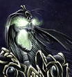
Like this --->
Yeah...
And perhaps color those wierd "S" designs on the axe in black of something like that.
Thanks for the critics and comments, I was kinda going for a egyptian monster theme. The face was done wrong because of my previous colour scheme, it interfered with the new colour scheme. The bandages are well, I ran out of ideas..heh. I was planning to re-do it however I dont really feel like working on this skin anymore so I uploaded it here. Anyway, thanks Wormskull
nice color scheme, my feelings are that the face is wrongly done, it looks like pastel and smoothed compared to the rest of the body, there is a lot of bandages, cross-hatches bandages, the skin is all about that, it may be a lack of creativity? the changes are nice, and everything is well definated, but theres too much bandages, it looks like a mummy! not much recolor, no apparant cnps, i dont have to whine on these finally.