Warcraft III resources & community, 2003–2006 · archived

FelGuard3.blp

not rated
Submitted by b17riderBurning Legion157 downloads87 KB
Screenshot
Screenshot
In-game
In-game
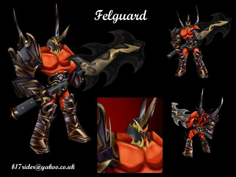
Based upon the original felguard
artwork by samwise...

www.sonsofthestorm.com

I always felt that the standard
felguard was lacking in terms of
originality (using the chaos grunt
skin, effectively, bit dull)

So here is an updated version...

Path - Units\Demon\Felgaurd\FelGuard.blp

Enjoy...
File Name
FelGuard3.zip
Download

Comments

11
your brush work is very noticeable; the skin not high-detail enough. aside from that, It's very useful and well done. I suggest blurring (not filter, brush) the breasts some so dodge work is not so visible. and remove the thing (kneecap?) from the back of his legs: it looks screwed up. the front has a subtle cartoony look, improving the in-game look. I say 4/5, well done, but if I were you I would (have) enlarged it some, then make high-detail; but that'd require you to do it over. anyway, nice. love the armorxz
very nice
very good skin
Thanks for the comments...
I have a couple of responses:

1 - wormskull, The face was changed cos I didn't
think the orc face suited a demon, and it does have
team colour, but only on the shoulder pad (cos the
pics were taken in the veiwer I chose a colour that
matched the armour colour, so you can appreciate the
skin for what it is...

2 - I tried a new technique when drawing the armour,
I resized the skin to 200% and then drew all the
armor, then resized it back to normal... allowed me
to get better detail and more blizzard-esque
texture... cool huh??

3 - In order to see the face on a model I did upload
the skin on the grunt model, and I liked what I saw...
I appreciate that not everyone will like it but, well
whatever... The face was meant to mirror the succubus
a little but have it's own individual qualities too...

Once again thanks for the feedback, you can be sure I
appreciate it... :D

Laterz...
nice work
You can't complain about the face because he wears a helmet, unless you put it on a grunt. Armor is sweet. Better than anything I can do. :(
Very nice. :)
the armor looks better and because on this you dont get to see his face very much because of the helment it doesn't matter that hes lost his detail. would like more detail on the bodie, battle scores and stuff. 4/5
Face was better previously, now it looks like it have lost the nice details. The armor looks very different of the previous one too, now its spiked and aggresive, like in the artwork, nice armor, bad face. All of the blue parts on his arm armor and maybe everywhere else looks like marine blue, its too dark, it would be good to put some team color or to lighten it up
Everythin is nice and i like those skins which r based on samwise art very much anyway....
The face is great but you can't see it ingame....thats bad... 5/5
gj - armor is very nice!