plz udpdate the link cause it's broken again,,,,
Comments
11
Oh, all of your skins are perfect.Can you train me in freehand skinning. 
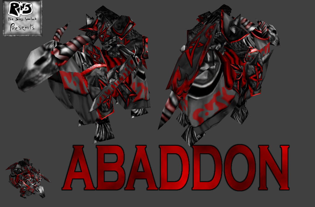
i actuly like the way the face is blurry. It looks "ghostly or ghastly" in a way.
cool man 20/10

wormskulls right...2/5, the green dreadlord one was much better...this ones blurry, no color, and it might be cool if the symbol meant something.

your skins are still using the same method, excessive recolor and filters, but atleast you didnt did that gold crap that looked like nothing like gold. The horse is simply poorly edited, you just desatured it and recolored red crap on him. The lower armor is recolor and filters, the upper part is a very poor recoloring. dont recolor, take your time. dont do filters, show your skills you might have.
the color palette is very bad, there is some pink-red with a lot of desaturated colors. it may look cool to you, but it's not, it's a really big lack of colors, but its understandable since it's a recolor, and not freehanded. all those pentagram crap is annoying, i dont know if its the meaning, the excessive use of it or the fact you mind find 5 billion pentagrams on a guy cool that makes the ambiant atmosphere poor.
yes that's it, no more than 1 pentagram, make a more interesting design to it, dont just apply a lame black contour and leave it like that. and increase your color palette, nothing is better than a drawing/skin with a very good harmony of colors
the color palette is very bad, there is some pink-red with a lot of desaturated colors. it may look cool to you, but it's not, it's a really big lack of colors, but its understandable since it's a recolor, and not freehanded. all those pentagram crap is annoying, i dont know if its the meaning, the excessive use of it or the fact you mind find 5 billion pentagrams on a guy cool that makes the ambiant atmosphere poor.
yes that's it, no more than 1 pentagram, make a more interesting design to it, dont just apply a lame black contour and leave it like that. and increase your color palette, nothing is better than a drawing/skin with a very good harmony of colors
![[DragonSS]amurai-X's avatar](/file/www1/images/avatars/11604255914119071e8f9ce.png)
The face is too... blurred, try making a skeleton face. Also, sharpen a bit the edges of the pentagrams. Really nice.

The face looks like it was blurred beyond no end. I like the armor, but the Pentacle thing isn't really accurate. Ever read The Divinci Code?

i dont like the face at all, everything else is good
edit- just seen crazys post, i agree
edit- just seen crazys post, i agree
I've tried to do an inexpressive and dark face...

Another Fallen Angel, I dont Realy like the Face but apart from that its good