Ok, i updated it, just added a lil more details, not much, i know :P And, at first, i din't understand what wormskull ment, but then, i got in :) thanks wormy AND THERE IS NO CNP OF NARZHULS ARMOURE!!! just for you to know, i did it all freehand :D if someone will use him path is: Textures\Footman.blp
if i dissed a skin its most likely beceause it's very bad. i am dissing antihero's skin altho they're good, but on every skins here there is flaws and improvements needed to find.
make your w2 dk correctly, maybe i will dl it, the one i was working on had two capes, a weird walk animation, and he holded the staff wrongly.
yes but some are good but all you do is point out the bad you're too negative man. Theres some great skins on this site that you dis on, hell cause of you im afraid of submiting one of my skins....Oh and ill make a d2 dk with a correct skin got cable recently gonna dl 3ds max...
wormskull you're such an annoying critic you like make ppl feel like crap about their work they worked hard on.. its not bad could use bolder details so that u can see in game better. Oh and wormskull i heard u were gonna reskin that wc2 dk can u release it?
lately, the only skins that might have the most chance of having a dir award would be antihero's. dont get your hopes up, but this wont get a director award, there is countless things to fix, including what i pointed in my previous post XP
I deem this, Best Footman Skin. Looks great! If you just had a little more detail on the face, I'd PM Sansui so we could agree whether or not to give this a "Directors Choice Award"
hehe, that what i was waiting for wormskill it's just that ordenery people say "yeah cool skin" but wormskull sees every lil thing, and helps to make it look EXELENT, thanks wormskull. And btw, is the face the same as the footman's Cuz i just painted his face grey and then made a new one... anywayz, thanks for all your comments guys (will update soon) oh, and if someone will use it, pliiz give me credit
watch out the face, you used very, very harsh shadows here, and you didnt really made a new one, you just drawed over the old face, taking the same structure along. the face could use way more variations, more colors and a little bit more care. the armor is a mix of green, lightning and shading, but you should use more than one color, its nearly impossible something in reality have only one base color, it might have a general color. you could, for darkening, use a little bit of blue, for example, it would be a good step.
tone down the amount of BLACK, thick lines, they're highly unrealistic, saying this is only a skin isnt a good reason, good skinners know you gotta make it as real as possible, not set yourself boundaries. the helm is a good example of excesive black lines. since that on the portrait, the helmet have a very important role, you should've taken a bigger care to it.
but anyway, it is an average skin on the wc3search scale. try, no wait, you must develop your shading lightning a bit more, learn to do credible faces, and use more than one color ( darkening/ lightning on the same hue doesnt count ) on your works, its a challenge. you might want to use a special burn&dodge setting, but i still suggest choosing your color from the color palette

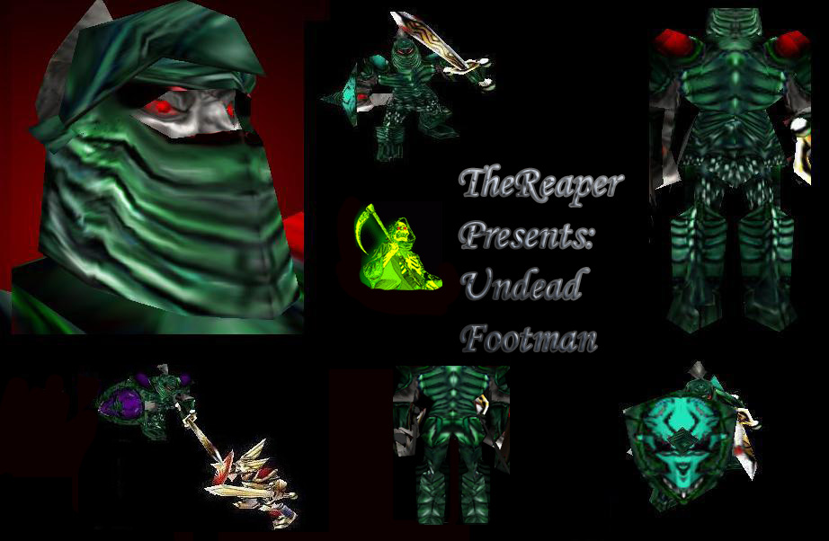


 not much, but i hope that's eniugh...


 i'm gana redo the skin, so wait for an update.


 it's just that ordenery people say "yeah cool skin" but wormskull sees every lil thing, and helps to make it look EXELENT, thanks wormskull.