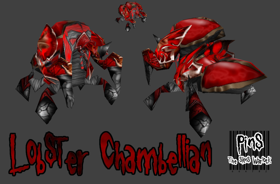
Wow 240 KB for this skin? The concept of the idea is very nice, I must say however the skin isnt something I like alot.
The colour scheme is nice, black + red is a nice colour. The cracks on the shell needs abit of definition but anyway keep working on it. Perhaps another version?
too much scribble on his bottom ( bottom of the uv skin, grey covered with hasty black lines) not enough proper shading/lightning. on the top of it, the red carapace looks like done in 3 seconds.
basicly, the only good parts in this skin are the one you didnt changed heavily
in overall it's kinda plain on the back. i think it would look much better if u used the "scale's" over the whole body instead of only the head and arms(the head is the best part of this skin). 3/5 u can do much better