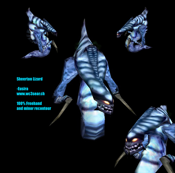
Simple skin, freehand and small amounts of recontour, the inspiration of Afro's awesome Protolisk skin face. Another use of massive D and B, and a first attempt at grayscale editing. All sone in Adobe Elements, and I don't know how to use filters.
I dont know who is the downvoter but I am the upvoter : it's very nice and I dont see where I can say bad things... Perhaps the eyes a bit too big, but all the rest is awesome ! 5/5
I used mainly a splatter brush on the side part, and some on the tail. I did try using a small marble filter, but it screw the skin so it didn't work. I really believe some noob probably flamed me with a 1
Needs more detail in general, especially on the folds. Try and give it the actual image of overlapped scales instead of just separated sections of skin.
The filter is a bit obvious, could use just a tiny bit of blending. Otherwise, I like it, really gives a nice speckled fleshy look to the tail. For someone who doesnt know howto use filers, you did a decent job with it. Even if it is an amateur skin, its a good example of how using filters can be a good thing.
The claws, I would reccomend a complete redo. Try and do something with them, like scratches. Maybe a different color such as violet mixed with the grey.
its good you dont know how to sue filters cause tehy are bad.unlesss you draw over them and jsut use them in moderation.teh calw could use some work. 4/5
Yes, I know it looks pregnant, but the wrap looks pretty nice on this one, especially that ugly bit right of the belly. Please don't flame--Give HELPFUL support.
Most of this uses the Oyster effect, which is a little noticeable. It's frikking hard, so don't blame me PLEASE for it.