wow i just realized how totw was an annoying noob ! Why i'm that nice with people ?
Comments
28very good ingame
My only objective

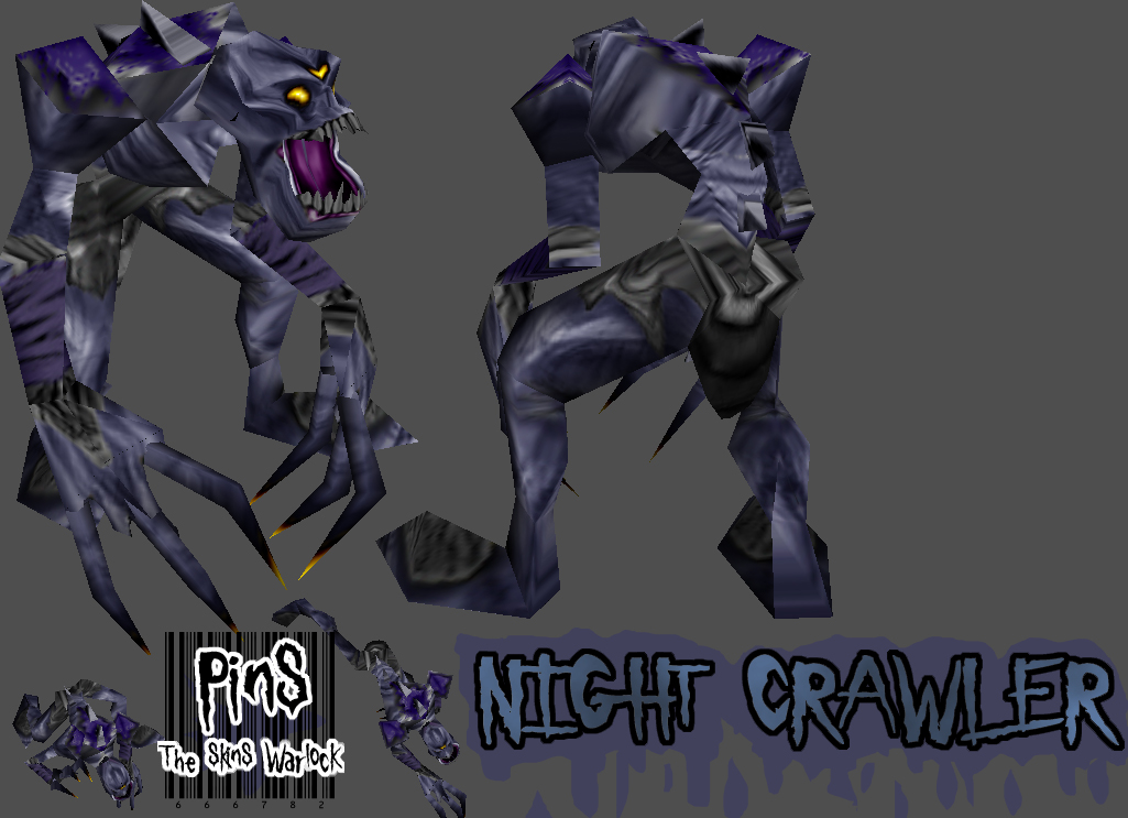
Retexturize the skin. Some parts don't fit with him.

In the last time the most good skins rated bad.This is a problem bcause I think it looks very good ingame and is very useful.Pins you have from me a 5\5. 
In fact, totw, I find IrBat's comment constructive because he shows me my bad parts then I can improve...
@ Mr_Psycho2000 : Ok thx for the tips I'll try this
@ Mr_Psycho2000 : Ok thx for the tips I'll try this
Tail, seriously, how is me pointing out flaws flaming? Stop hanging from Pins's nuts... 
Nice job Pins. I like it how you made an extra eye on him and how you removed the hair.
the colour and change to the face is nice, the bodie lacks contrast a bit, could use darkr tones around the rib cage.
the freehand scribble gives it texture and its what makes pins skins pins. pins do you have adobephoto shop, if so go into it and go to sharpen, press unssharp mask move the top bar slightly along and the middle bar further along, this will enhance the lines and image making the textures and image stand out much more. then go to image, adjustments, gradient map. click on the greyscale until another barscreen loads up. click on the arrows at the bottom were the blacktowhite bar is and move the white one across a bit and move the black one across a bit, then close it and go to edit (edit is at the top) click fade gradient map, it will bring up another bar, go down and select softlight and that will enhance the image once again, if it apears too dark then u can lighten it with the same bar moving it across. if you do this for your skins your skins will increase in quality by 2%
the freehand scribble gives it texture and its what makes pins skins pins. pins do you have adobephoto shop, if so go into it and go to sharpen, press unssharp mask move the top bar slightly along and the middle bar further along, this will enhance the lines and image making the textures and image stand out much more. then go to image, adjustments, gradient map. click on the greyscale until another barscreen loads up. click on the arrows at the bottom were the blacktowhite bar is and move the white one across a bit and move the black one across a bit, then close it and go to edit (edit is at the top) click fade gradient map, it will bring up another bar, go down and select softlight and that will enhance the image once again, if it apears too dark then u can lighten it with the same bar moving it across. if you do this for your skins your skins will increase in quality by 2%
uuhm, IrBat wasnt flaming.
they are right, there are some strange looking scribbles.
they are right, there are some strange looking scribbles.
IrBat's description
Flames
Flames with USELESS COMMENTS
Is a crapo
Dumb
Dumb
Dumb
Stupid
Flames
Flames with USELESS COMMENTS
Is a crapo
Dumb
Dumb
Dumb
Stupid
Ok, lets see...
- Poor shading and physical body contours
- 5 year old style scribbles
- Thick black contours on the cloth. No color/texture to the cloth. Doesnt look like clothe at all.
- Thick black contours around the eyes.
- Legs and arms need shading in the joints
Ok, there ya go.
- Poor shading and physical body contours
- 5 year old style scribbles
- Thick black contours on the cloth. No color/texture to the cloth. Doesnt look like clothe at all.
- Thick black contours around the eyes.
- Legs and arms need shading in the joints
Ok, there ya go.
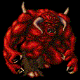
Fix his face it looks like liquid
that's a language than I understand ! Ok Afro, thx for the tips 
Quote:
WHat the crap....
Quote:
you're getting worse pins...
Quote:
What happened pin did you forget to finish it?
I'm getting sick of these useless comments so I'll say a last time :
EXPLAIN PLEASE
thx.
i do believe they are right, the major problem is that you are using thin lines at inaprropriate situations, most likely the only good time to use thin lines is if youre doing hair or fiber witha a coarse texture. also if youre using a small uv field
looks good, I'm thinking of using this on my map 
WHat the crap....
you're getting worse pins...
What happened pin did you forget to finish it?
I'm getting sick of these useless comments so I'll say a last time :
EXPLAIN PLEASE
thx.

Better than the previous one, but still misses something.

good 4/5

Pins you need to stop scribbling... 4/5
still alot of scribles.but beter than your other.
4/5
4/5
nicee
4/5
4/5
great use of my idea 5/5 for u
5/5 for u
What happened pin did you forget to finish it?
Very nice, Pins!

you're getting worse pins...
Hey pins what program u use when u mak ethose cool skins do you use adobephotoshop or paintshop pro?? 

i agree with Crazynutter better than the other one 4/5
Its better than the other 1 4/5