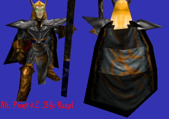
very sketchy and rough, not a good thing. for metallic effects it is best to use dodge and burn. face could use some changes too. the cloak has the same patter going all the way down it, try to make it look more realistic.
the face needs some small changes aswell to make it seem alot more different compared to the other preists. the cloak on the back needs changing, you have to darken the lighter grey patch on the cloke so it blends into the rest of the cloak. 3/5
Much better now. But, the thigh's lines are still a bit too thick, and the same with the pads. The wrap is impressively good, and now, deserves a 4.7/5
player_72985 this obiviusosly isnt 5/5. but deserves some were between 3/5 to 4/5. but u can go think its 5/5 cause its your opinion. 3.5/5 make it look more liek cloth not treebark
The pants and armor are a bit too cartoony and scribbly, and the face is kind of unchanged. The caped is pretty good, but the lines are a bit clumped together