Warcraft III resources & community, 2003–2006 · archived

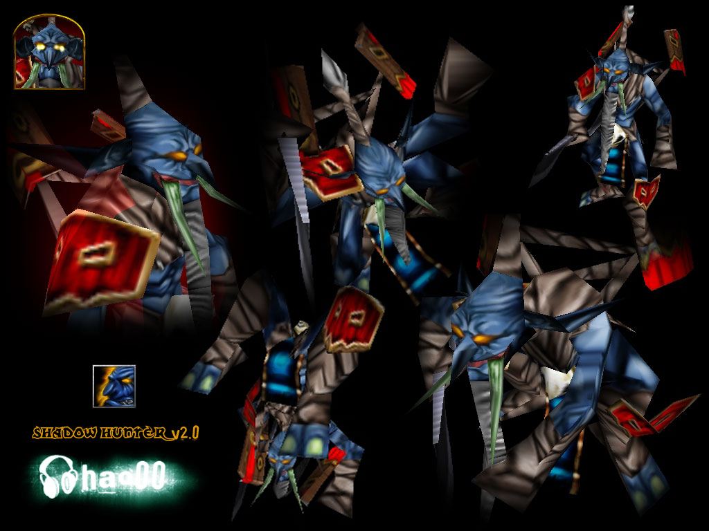
HeroShadowHunter.blp

not rated
Submitted by hao00Orcs143 downloads85 KB
Screenshot
Screenshot
In-game
In-game
well... this is the first skin i guess i put effort, its just a "scrap", ill post it here to IMPROVE IT (i hope that someone comments something constructive), i know its ugly and I could have more effort on it, so, help me!

The icon, well, the first one i made, i really hope you like it.
File Name
HeroShadowHunter.zip
Download

Comments

17
this is good, you mind me using it in a update for my cinematic called orcish Castery - era of the magicians?

will credit it no doubt.

greets
/Warnicro/
this is good, you mind me using it in a update for my cinematic called orcish Castery - era of the magicians?

will credit it no doubt.

greets
/Warnicro/
He's not ugly, He is old :roll:

You should shade him so more :wink:

I dun think the skin is so bad actually. Almost 4/5 :D
hum, ok, i guess noone will comment more anything, so, ill try to improve what you ppl said ^^
for a first undeleted its good.il give you credit for actauly trying to improve!not a very much seen scenerio when it comes to noobs.
the tusks are...bad very bad color selection.the skin parts look like a fiar bit of smudging then sharpening adn a little bit of redraw.as for the clothes teh look repedative and allmost like they were a texture.
over ncie skin.muscles done very wrong.too much shadows in between.completly agreed with erts"raisin hunter comment"
3.5/5 ya its your first skin but you actauly improved form your panda guy.
the colour of the bodie is nice, darker than the previous version wich makes it stand out a little more from the other version. i think it would look good if you put a red x on his face or a tribal pattern so it brings out his face and makes him unique. then purhaps some tribal patterns on his bodie but not black as that would clash with his muscles. do a new style of mask for him aswell then if you know how to do cnp with textures you could put a nice texture over the mask and bodie then enhance it once more and everything will stand out and look nice.
foot looks weird on screenie, but i can only see them once so cant really judge that. i think his head is a little weird, the above part mostly. its just ... weird.

you used the same pattern allot of times on body. it would have been ok if you used it once since it aint bad but using it so much makes it look bad. (beard uses same !? )

i dont like the green horns (more personal thought :p)

top of spear on the thing he has on back looks bad. actually i dont like the entire thing hanging on his back.

overall good skin though, just giving my comment
4/5

ty all for commenting ^^
cool to see a skin where there is actually nothing wrong with the shading.

i dub him: 'the raisin hunter'.
I like it, it looks much more evil than the original. Though the icon does need work...4/5

Nice for a first skin.


Btw, I think he's trying to say "STFU, this is a good skin and you SUCK at skinning." But I'm not sure. :?
Pretty good skin, very nice for a first.


PS
stfu, good skina dn you SUCK at skinning


What the hell are you trying to say?
its ok but a good start none the less


stfu, good skina dn you SUCK at skinning
that is very sick my good man

kudos to you on making such a handy voodoo skin!

4.7/5, due to the small amounth of sketchyness in the beard
:? its ok but a good start none the less
... yellow murloc = noone need to see it, that was just a insane scrap =P
yeah hao ... its good but, where is ur yellow murloc ? lol icon is ugly =/ 4/5 (cause u are my friend /o/) :lol:
er..... bad english, i said: "I could have more effort", its "I could put more effort" :P

-edit: bah, i wrong again haha ;D