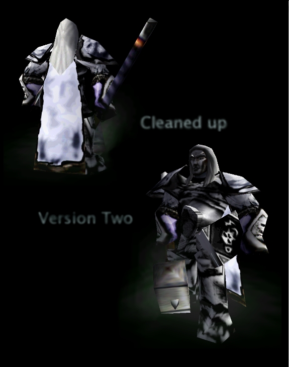
90% Freehand, 10% cnp. the only cnped thing is the lower arm thing jutting out of the skin unwrap, hair and face. from the cinematic arthas armor. I'm very confident about this skin, and think it's good enough to post here. ugly on unwrap, good ingame. I want this skin to be judged only on how it looks ingame, because people making maps with this will never see the unwrap, but they willl see how it looks in game. duh. so: Please judge this thing on in-game ness, but crtiquing my methods is stilil welcome obviously. see comments for list of redone things. (mostly). UPDATE: shaded cleaned outlined darkened
ok. ill crop it to a modified shape template, then outline with two overlay black brushes; making it look more ... ... organized. well ill update sometime today. since this comment is still on top, heres the update I cleaned it, outlined it, shaded dodged burned if you think it needs to be lightened a little bit, just tell me and I can dodge it up.
its a good start, but your shading is a complete mess. a.k.a. there is none. no shading. it needs shading.
you have to find a way for yourself to define your lines, and skin. it just looks like a complete mess, it looks like my room on a sunday.
just want to say that the cape is really ugly tho, pretty much ruins what could be saved. it looks... i dunno, like wet paper or cardbord, nothing like seal fur at all.
so, overall, make it less jumbly, define the diffrent parts of the armor with (light, not sharp) black lines, just subtle to keep the cartoony look, but make it somehow also kinda realistic and stuff... yeah...
there are no filters. the scribbles are completely purposeful. the only exception is the tiny line jutting out the left shoulderplate. It may be ugly on the unwrap but it looks good in game. ill put that in the info. one-pixel lines make skins look very nice. for example the foot you can see on the shin, I used a 100 % midtone burn one-pixel giving a nice cracked look to it. and sc_freek even it was 'random scribbles and filters', that doesn't tell me how to improve. skins are meant to be judeged on how they look in game, because when people are making maps, people won't see the unwrapped skins, but they will see how they look in game. because theyre playing. duh. ill put that in the info too. well thanks for the crtiquing and commments. btw halo can you be a lil more specific about what cnped parts you like? heres also a list of what I redid: body legs both shoulderpads cape added a pupil, and though the image says the pupil is still there on the left-hand side of the unwrap, its not. I alphaed it. lotsa other tiny things I don't wanna miss, but don't wanna explain. and the cnped parts, most of em were modified in some way.
sure is scribbly but i dont see many filters.though the parts i like are mostly cnp.The blp reminds me of one of sansui's arthas skins somehow.It's messy and that's for sure. 2.5/5 if you could clean it up maybe 3/5.
That is really nice. Definately worth posting here, considering it's better than 75% of what's already here.
I like it, it's a crisp take on Arthas, unlike all of the other skins that are 100% CnP off of the cinematic Arthas. This actually brings the word 'fresh' back into the name of Arthas, well done.