Warcraft III resources & community, 2003–2006 · archived

Soulblower.blp

not rated
Submitted by PinsMiscelanous136 downloads335 KB
Screenshot
Screenshot
In-game
In-game
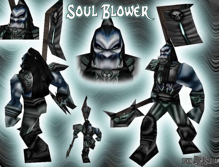
Soul Blower

That's perhaps the skin I most worked on. Enjoy and tell me what you think ! Facial deign is inspired by a book cover, "Ryûnosuke Akutagawa : Rashômon and other tells".

It's some kind of half cyborg fighter...
The flag was really hard to skin.
File Name
Soulblower.zip
Download

Comments

10
the flags alright the face is nice and chest and patterns or nice but the arms legs or lacking like a few people have said. the arms and legs only need detail and purhaps better shading too them then it will be ok, not too keen on the design but i like the patterns you cnp on they might be better used on some other model.
i know. that's my major problem.
I only took 2 hours to this one, no more.
But I perhaps found a way to avoid that ! Ill do head and chest first, then go on a secondary skin (for exemple a request :lol: :lol: ) and the next day back on the True skin. What about , ill try on my next, just have ti find an idea...
Like Dead dogs metioned. Your skins improve every time but the problem is that you put all your effort into one area like in this one on the face and chest.
a 512x512 frame allows you to put lotsa detail....take advantage of that on the legs, arms, hands and feet. chest is amazing.

4/5
The whole skin amazingly looks like Gar'Nogals work with a little to much blur. But who care its a dam good skin but a strange choice for a topic :wink:
The head and chest armor are perfect! shading is pwnge. The only bad thing is that the pence and arms are 2 blurry
that chest armor looks fantastic
lol :lol:
just in the corner^^ i sometimes get some problems to put it :lol:
"Pins I SKIN SO I AM" is very good hidden ;)
Overall i think its to monotone. Its of very good quality though. I absolutly LOVE how you shaded the armor it looks very clear. The legs seem to be blurry compared to the rest of the skin. Nice job on the face as well but i think if you added some more color (no idea what) it would be alot nicer. 8/10 in my book. :D