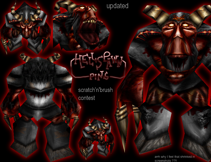
Neat, but you need to have more scratches on your metal
Comments
15

not bad for a high res skin. although you use too much pure black in the skin which messes up definition and coherecy.
I did this already, but i after all, I tested it in game and doesnt looks too bad, you just have to scale up a bit, not too much, like 1.2-1.50 i'ld say...
I agree. Excellent unwrap, but toomuch of the detail is lost in the wrap, making it look much more bland in-game. Very nice work, though. Perhaps define the details more to they show up better?
-VGsatomi
-VGsatomi
hey pins. glad to see more skins from you
YEs, I promised you i would remix some fallen angels, ididnt forgot don't worry, i was just needing to get back in the demaonic ambiance, Rob Zombie and Belphegor helped me^^ [/shameless lie]
Better, much better.
If you can't alpha the teeth .. then it's hard to do it perfectly.. And I guess you're not lying about the nose either. I guess this is almost as good as it gets.
If you can't alpha the teeth .. then it's hard to do it perfectly.. And I guess you're not lying about the nose either. I guess this is almost as good as it gets.
hey pins. glad to see more skins from you  .
.
.In fact, if i down the nose, it would wraps awfull and very stretched...
About the teeths, i was very surprised when i saw that there wasnt alpha possible on them !
EDIT : Updated !
About the teeths, i was very surprised when i saw that there wasnt alpha possible on them !
EDIT : Updated !
Nice work, Pins. I bet you pushed me down at 4'th in the contest now. (I'm not done yet tho)
Too bad it wraps so bad between his mouth and nose. And the nose looks a bit awkward (Weird, stupid.. Hehe)
You should edit it. Perhaps you should make it less highligthed on his legs, but more on the symbols.
I can see you placed the teeth abit to far down, so their edges don't show up.. you should fix that.

Too bad it wraps so bad between his mouth and nose. And the nose looks a bit awkward (Weird, stupid.. Hehe)
You should edit it. Perhaps you should make it less highligthed on his legs, but more on the symbols.
I can see you placed the teeth abit to far down, so their edges don't show up.. you should fix that.
It's done, i'm ficing the model
Il post it later, i obnly enter the skin in the contest
Il post it later, i obnly enter the skin in the contest
Good work althought it would be nice to see this guy with fat devil wings. Maybe you could alterate the model a bit.

Wow this is really awsome Gj!
I recently did a skin skin with highdetails but low polygons and bad streching
I saw it, and I give you again all my congratulations, it was simply photorealistic.
I'll redo hooves. I don't understand really what you say about mouth (i didnt improved in english^^)
I'll rework the symbol also
Nice stuff pins.
I know how you feel about the bad wrapping...
I recently did a skin skin with highdetails but low polygons and bad streching.
The mouth has the worst streching from what I see.
Tof ix it make wrinkles going downwards,displacing the teeth almost.
The nose looks too much inhuman.
The pentagrams and the symbols need more highlights.
Give the eyes a downward look and make them reflect light of the armor.
I sugest re-doing the hooves.
Don't change them to boots or anything...
...Its too hot in hell to walk in boots!
The rest doesn't need much change.
4/5
Just update his file and i'll update this.
I know how you feel about the bad wrapping...
I recently did a skin skin with highdetails but low polygons and bad streching.
The mouth has the worst streching from what I see.
Tof ix it make wrinkles going downwards,displacing the teeth almost.
The nose looks too much inhuman.
The pentagrams and the symbols need more highlights.
Give the eyes a downward look and make them reflect light of the armor.
I sugest re-doing the hooves.
Don't change them to boots or anything...
...Its too hot in hell to walk in boots!
The rest doesn't need much change.
4/5
Just update his file and i'll update this.