Warcraft III resources & community, 2003–2006 · archived

Manastrike

not rated
Submitted by 2v2NEJASS Enhanced543 downloads41 KB
Screenshot
Screenshot
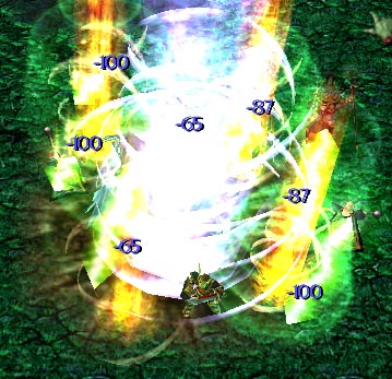
Screw the whole "The caster englufs the enemy in magical blah blah". Basically, this is a Flame Strike which burns mana instead of health.
File Name
Manastrike.w3x
Author
Unknown
Download

Comments

11
4/5 screenshot is good and the numbers are good too! :D
green lightning isn't perfect but it looks more like mana burn with it :?
i think you shouldn't change the secondary flamesto blue
good work!!! :D :D :D
I think the numbers are a good effect... Besides, it allows the person to see how much dmg is dealt by mana burned.
I like the numbers. They are good to show extraodinary damage, like crit, bash, and mana burn. Makes it seems more original i think... but the mana burn lighntning gotta go :D

CannabisX, 03-01-05: "cant really see if that spell is good or not with that screenshot, but its very convincing; 4/5 from me, gj"

Why the hell do you jugde a jass triggered spell on the screenshot?!
cant really see if that spell is good or not with that screenshot, but its very convincing; 4/5 from me, gj :D

-canni
Hey, I like the numbers though! That way you see how much damage you've delt to the enemy WITHOUT going back on the spell tooltip to see how much its supposed to do. But I agree to try and get rid of those green lightning bolts! Overall I like it 8)
Yeah, I'm still learning JASS so I converted it and messed around with some stuff to better understand it. I'm tryin to do my next spell all in JASS. :shock:
You just converted to Custom Text,didn't you? :twisted:
You can edit those secondary yellow/red flames too, you know. You know, to make them also blue. They're in Effects.
Well if it IS based on mana strike (didnt look), then the numbers are unavoidable.

EDIT:Yup, based on mana burn.
i kinda like it, but i agree that the numbers should be removed.

also, can you make the green lightning bolts go away, too?

try not to make it so obvious that it's based on mana burn.
good concept 3.5/5
take out the blue lettering, it makes it look tacky/choppy. plus in a flame strike u dont see red lettering showing how much damage dealt.