
#1
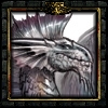
My Newest Signature
12 posts
#2
hmm, 3/5. Too much blank space, you should add more background texture, but good color selection.
#3
Nice Sig, but I agree with Leopard, needs some sort of backround or texture, Good Job though  .
.#4
I like it, but you shouldnt add anything, there's no need of a bckgrnd here, it would be, too much 
(and about mine ?^^)
#5
Previous was better Pins #6
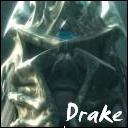
there, i fixed it up a bit.#7
very nice, but dont add anything now 
I love your avatar too^^ http://img239.imageshack.us/img239/8116/morello3qc.jpg
#8
thanks!the avatar took me a while.
i had to play the music video on itunes the screen shot each frame (45 of them)
then scale them down and change the color (to not go over the 100KB max)
it would look better if i could put some color xD.
thx 4 the posotive feedback.
#9
cool sig#10
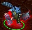
i changed it 
#11
ummmmm How do you even make a sig? 
#12
It seems dat every 1 has a kewl sig... and i dont got 1.... Makes me feel left out 