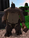
I really dont like the Tauren and the Nerubian. Actually none of those is very good, really to colourful, no shading and the colours arent realistic at all -.- Blue hair etc... The best of those are the elven swordsman and the blademaster. after that the demonhunter
i do know that thier not good thats why i said they were nooby ^^
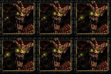
the crypt fiend was just a muck around thing the elven swordsman was my second one the first one i deleted the demon hunter was a thing a friend requested just like the tauren chieftain the arthas and priest i done cause i was bored and while i was still experimenting the blademaster was my latest wich is the best IMO looks like he got into a big war ^^
haha they look really cool (all of them). But if i had to pick out of them, i would say the blademaster looks rather nice. Keep going, before you know it he'll look really nice! But to help you out, i think you should make the colours a little more 'gritty', more darker maybe. Keep it up!
DaminonI say you need much more training. The only one I "liked" was the Blademaster and the Captain.
well i am still getting better but im not to sure why the captain is one of the faves lol it was my 3rd one probly cause his a hippi like the fiend
haha they look really cool (all of them). But if i had to pick out of them, i would say the blademaster looks rather nice. Keep going, before you know it he'll look really nice! But to help you out, i think you should make the colours a little more 'gritty', more darker maybe. Keep it up!
lol thanks but i would say them all looking cool is an over exaduration but thnxs anyway right now im not gonna work on skins though im making a map ^^
Your second Blademaste looks ALOT better. Is that alpha-ing i see on his blade? damn i cant figur out how to alpha myself. Btw, it was a good idea to show these in a forum. Good way to here wht the public thinks without harsh critisism.