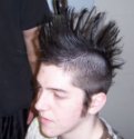
looks ok??? looks like...let's just say this is less than avarege, the hatching is realy bad, it needs to be more uniform, not randomly in all directions. And for crying out loud, don't smudge pencils, it looks very ugly.
And what do I think of it? I think it's very ugly (the drawing, not the character...wich by the way, it's ugly too...note that I wanted to say it's crappy, but I retained myself) and messy. No offense, but you told us to say what we think.
Waldbaer
#4
Looks not bad, but the proportions of the face are a little unexact. His left eye is a bit too much left, it misses the connection to the other eye and should have darker shadows. All in all quite impressing for non-pros, but I don't think it's useful because there is no coloring or something like that at all.