175 posts2004-10-22
#1 2005-02-19
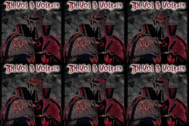
Rate this sig 1/10 http://www.aggressivegaming.com/pics/punx1.gif hmm I made for a Clan BHL member on Diablo II... Please rate it, critisize, w/e you gotta do...
1,176 posts2004-07-02
#2 2005-02-19
It's ok, but I can't see much of those letters.
175 posts2004-10-22
#3 2005-02-19
hmm, I can see the letters fine -_-
heres the pic w/o text on it...
http://www.aggressivegaming.com/pics/abrep1.gif 839 posts2004-08-17
#4 2005-03-09
its GG! 9/10 if u ask me... if only u could help me *hint hint plz*
143 posts2004-11-27
#5 2005-03-09
Alot of people don't know how to rate, L.O.L.
7/10.
10/10 means it's perfect. But I'm not going to rate it as that...
839 posts2004-08-17
#6 2005-03-09
alot of people criticise cause they dont vote the same
(L.O.L 1337 UB3R ROXX0RZ!111) = no thx
175 posts2004-10-22
#7 2005-03-15
another sig I made, I am using it, but if I ever change sig and anyone looks at this...
http://www.aggressivegaming.com/signatures/modz0cv1.gif 142 posts2005-04-07
#8 2005-04-16
the first one is a 7, second a 6.5
175 posts2004-10-22
170 posts2004-12-06
#10 2005-04-23
I love the third one.
and these could be used by anyone? or are they just for rating?
178 posts2005-03-08
#11 2005-04-29
The 3+4 are really nice
8 posts2005-08-01
#12 2005-08-01
The Shao Monk one isn't good, you need to blend the render more, the one before that is alright, the one before that isn't good, it looks like a border... Then the one before that, is ok. Your first one is way too dark and where is the render? It's too plain.